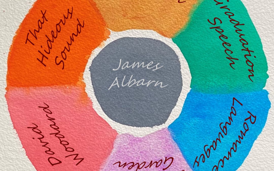

Seven Songs for a More Colorful Tuesday
 In the opening moments of my college crystallography class, an ancient professor named Kaupp stood before us and intoned: Goethe said, ‘Symmetry is rhythm standing still.’ After this promising opening, Herr Professor proceeded to disabuse me of any notion that the class would be interesting.
Goethe was a natural philosopher whose Theory of Colours cataloged hues using human perception and observation, rather than via the coldly intransigent waves and rays of Newton. He related colors to emotions: The colours on the plus side are yellow, red-yellow (orange), yellow-red (minium, cinnabar). The feelings they excite are quick, lively, aspiring… The colours on the minus side are blue, red-blue, and blue-red. They produce a restless, susceptible, anxious impression.
But Goethe was not up to the task of matching colors and music. Colour and sound do not admit of being directly compared together in any way, he wrote. They are like two rivers which have their source in one and the same mountain, but subsequently pursue their way under totally different conditions in two totally different regions, so that throughout the whole course of both no two points can be compared.
So let’s take up the challenge of uniting Goethe’s rivers by describing a selection of songs using color. Assisting us in the endeavor is Diann Zimmerman, Education Director for the Watercolor Art Society of Houston. Diann’s organic feel for music and color has been featured in the album art of Yutzy, Troy Santolla, and the recent Wild Daydream – Sooth collaboration. Diann listened to each of today’s tracks, then selected the color that matched the song’s mood.
Tim Buchanan – It’s Not the Worst for Me
Color: Quinacridone Gold. An embracing, empathetic color. A very warm, transparent yellow that granulates into multiple shades when brushed into the paper. The light shines through this pigment.
Romance Languages – You’ve Got Everything You Need
Color: Cerulean Blue. The fresh cool blue seen from an airplane window at 30,000 feet. The color cannot be seen from the ground looking up; its intensity exists only above the clouds.
David Woodard – Surprised by Sunshine
Color: Permanent Scarlet. A warmer pink, an optimistic color, happy when it needs to be. Dilute to soften the effect, adding a melancholy wash of water.
James Albarn – I’m Not Coming Home
Color: Payne’s Gray. Created by mixing blue and black. Brushed into shadows with blue tones in the depths. Colors the darkness with hope.
Graduation Speech – Keep Still
Color: Phthalo Green. This pigment attracts attention. The soothing vibrance draws your eye — or ear — and retains it, in a good way. You want to be there, to stay there.
That Hideous Sound – How Many Times
Color: Transparent Pyrrole Orange. A fast color full of energy and movement that combines an aggressive red with an organic yellow. The antithesis of the tranquil ultramarine blue, its complimentary hue on the opposite arc of the color wheel.
The Churchhill Garden – Lonely
Color: Cobalt Violet. A gentle, mystical color. The beautiful softness of the song suggests subdued colors; there are no bright blues, greens, or aggressive reds here.
Did we succeed where Goethe failed? Who can say. But you can succeed in adding some color to a musician’s day by listening to — and purchasing — their music. Just click on the song title in the Bandcamp player to visit the artist’s page, where the track is available for download. And be sure to check out our Song of the Day playlist on Spotify, featuring twenty-one hours of music by great independent musicians who paint in many styles and mediums. You are sure to find a color that matches your mood.
Charles Norman is a writer and historian. Email: reverb.raccoon@gmail.com. Or follow on Instagram and Facebook.
Latest Posts
Here Lies Wilson Matthews – 1 Who Was W.M. Matthews?
But he wanted to get in. He wanted to be urbane and careless. He wanted to wear well-cut clothes. He wanted to be a gentleman.-- Thomas Wolfe, Look Homeward, Angel Part 1Who Was W.M. Matthews? Mississippi State University – then Mississippi A&M College – entered...
Here Lies Wilson Matthews – 2 Who Was Blanche Dumont?
Here’s what I want. I notice you changed your name. I want you to keep your new name. I guess you made up someplace you came from – well, that’s where you came from… You figure you died and now you’re somebody else and we’ll get along fine. -- John Steinbeck, East of...
Here Lies Wilson Matthews – 3 Guy Town
He was surrounded by a world that was both beautiful and terrifying, a land of secrets and shadows, where the line between civilization and savagery was thin and easily crossed--Joseph Conrad, Lord Jim Part 3Guy Town Miss Blanche Dumont became a sex worker in Austin,...
Here Lies Wilson Matthews – 4 Spaced Flashes
In probing my childhood (which is the next best to probing one’s eternity) I see the awakening of consciousness as a series of spaced flashes, with the intervals between them gradually diminishing until bright blocks of perception are formed, affording memory a...
Contact Reverb Raccoon
Categories